Featured

8-31-17 Gothic Head Swap and Jaguar X

This is the post excerpt.

RJ Li

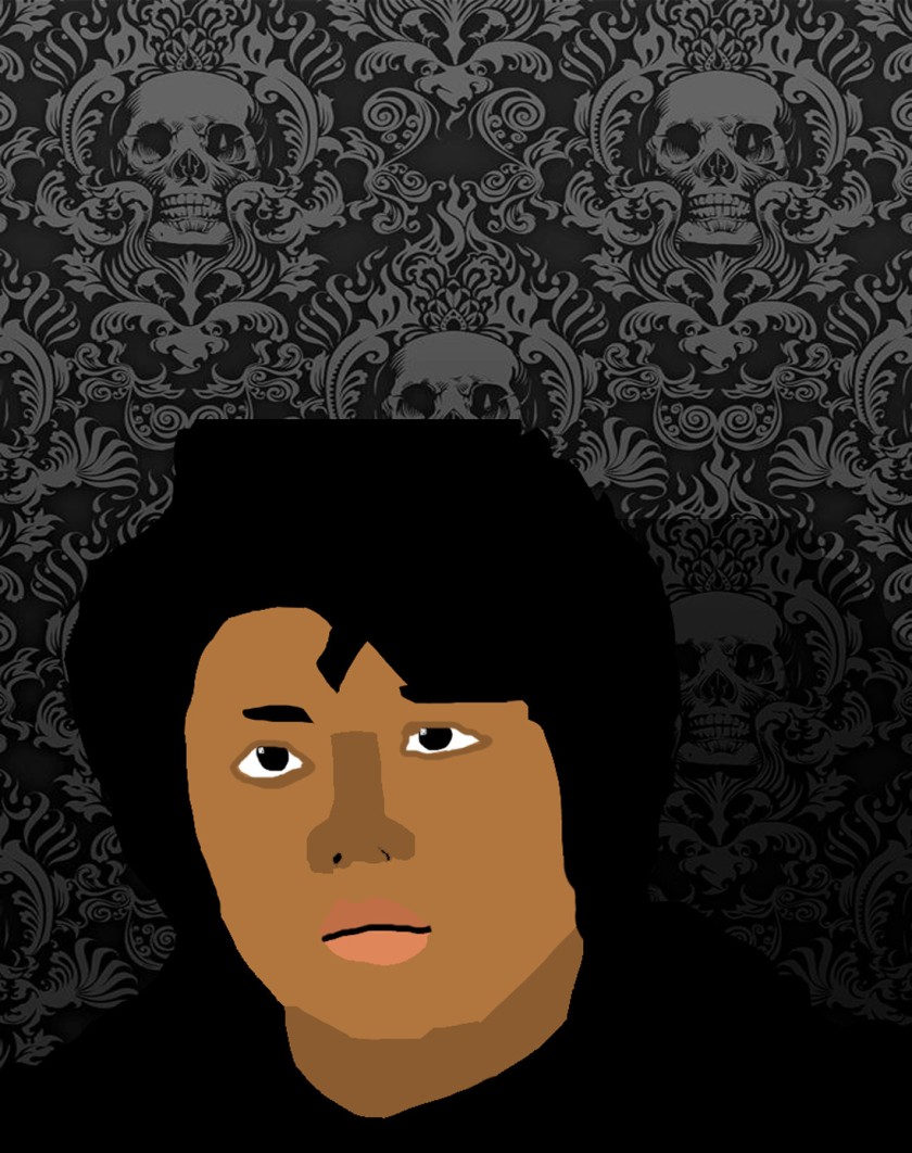
My first time doing an assignment in Photoshop was fairly easy. My first assignment was to swap heads of man to a woman’s body and a woman’s head to a man’s body. This assignment is titled “Gothic Head Swap”. Learning the shortcuts on Photoshop were difficult at first but it got easy over time. Everything else was fairly easy to learn and I didn’t have an issue with anything else. What I did was trace the guy’s head with the magnetic lasso tool and then use the regular lasso tool to remove and add some parts on the head. I then copied and pasted it to make a new layer and lined the man’s head with the woman’s head and covered her head. I also did the same thing with the woman’s head. After I swapped the heads, I used the clone stamp tool to remove any excess background. Then voila I was finished.

This slideshow requires JavaScript.


The second assignment I did was something called “Jaguar X”. This assignment was a pretty cool one.JaguarX_2-Final

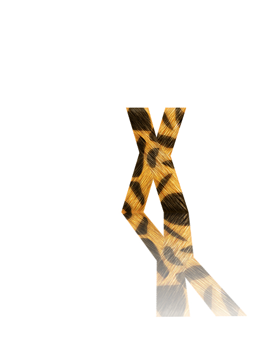
When my teacher introduced this assignment and showed us how to do it my mind was blown.What I did was make a layer and type the letter X, color it a specific color using RGB, used the lasso tool and made jaguar spots, duplicated a layer, used two filters (Noise and Blur), merged the two layers, made the copy layer a soft light layer, and made the copy a reflection by using the free transform tool,flipping it vertically and skewing it.

5-17-18 My Spring Portfolio and Finals

This week I’ve been mainly focusing on working on my Spring Portfolio. My portfolio consists of all the work I’ve done this past semester. I made a similar portfolio last semester but it was Christmas themed. It’s a Spring Portfolio because the theme of my portfolio this semester is the spring time. I’m creating my portfolio in InDesign and I made the background in Illustrator.

Portfolio_Background
Portfolio Background

The assignments that my portfolio consists of are my Propaganda Poster, Prom Invitation, Personal Logo, Shimmering City, Low Poly Mountain, Angelina Na’Vi, 2nd Client Logo, monster project, and the Animated Flower. I’ve finished applying all of my work into my portfolio and it took awhile to write short descriptions of the assignments because I can’t just retype a blog under the assignment. For my cover page I decided to do another “self portrait” (in vector art style) in Illustrator. I took a picture of myself standing and I recreated myself using vector art. Here’s what my portfolio looks like so far.

This slideshow requires JavaScript.

I’m not finished with it yet. I still need to put some finishing touches on it and fine tune it. For now I think it’s ok but it clearly still needs some work. Besides my portfolio, I have other things to worry about like finals. I’m pretty sure I have everything in my math class, graphic design class, PE, biology class, and my drama play down except for English. English is my hardest subject and the final for English might drive me inane. That’s all for today and I’l talk to you guys again soon.

5-10-18 Finishing Client Logo, Monster Work and Spring Portfolio

Sorry there wasn’t a blog last week, I forgot to make one. Two weeks ago I left off on finishing up my client work. After I finished my client logo, my partner and I had a “meeting” with our client to see which one of ours he liked the most. The logo he chose to put on his slideshow was my red and blue “NBA like” logo. After finishing our logos, my teacher gave the class a new assignment which was to create a monster that an elementary school student drew. My monster’s name is Big Bertha and it is a slime monster who lives in a swamp and it eats people. So what I did was create the monster in Illustrator using the pen tool for the head and arms, the ellipse tool for the body, and the rectangle tool for the legs. I then filled the monster with a slimy green and I added on the details that were on the kid’s drawing. I put a yellow to red gradient on the eyes to make them look more dangerous and crazy. After finishing the monster, I put the monster in Photoshop and put the monster on top of a Shrek swamp background. I then got the idea to put heads on sticks to make Big Bertha look like a monster no one should go near and so it could also have several midnight snacks. I put the heads of some of the most hated people in the world on the sticks like Jake Paul, Donald Trump, RiceGum, etc. Here’s the final product.

This slideshow requires JavaScript.

Now that I’m finished with my monster, I moved on to working on my Spring Portfolio. My portfolio consists of all the work I’ve done this past semester. I’m thinking of making some sort of “Springy” background but I might just stick with the baby blue background I have now. That’s all I have for now, until next time.

4-20-18 New client project

This week has been a weird one. Since testing is going on in my school, everyone had to go on a block schedule. Which means I had only 3 days of my graphic design class to wok on anything. On Tuesday, my teacher announced that we will be getting new clients and designing logos for them like we did a few months ago. The client that me and my partner got said he wanted a mobile sports game based on the PGA (which is the organizer of the main professional golf tours). Initially he wanted to make a mobile football game but when my partner and I said that a mobile football game already exists, we went through many sports and sports leagues that already have mobile games. Then we brought up golf to our client and he chose the mobile golf idea. After coming to an agreement, we started working on the logo design. Our client said he wanted a simple logo that will make people stop what they’re doing and look at it. So, my partner and I came up with the idea to make our client’s logo look like most national sport logos (NBA, MLB, and the PGA). What I did was cutout a picture of the famous golfer Tiger Woods, change the brightness of the cutout so the cutout is a blank white cutout, and I exported him as a png. I then sent the cutout to my partner and I continued working on the logo design. Our client said he wanted at least some green in the logo so I made 2 logo. One that matches with our client’s idea and one that looks like the NBA logo.

This slideshow requires JavaScript.

4-12-18 New Computers and Animation Assignment

Last week was Spring Break (which is why there wasn’t a blog last week). When I came back to school from Spring Break, I was surprised to see new computers in my Graphic Design classroom. These computers are much more bigger than our old computers. The new computers we got were iMacs and they do a lot more things faster than the old computers. What I did first, was I linked the data from my old computer and added all the Adobe programs that we will need to use to my toolbar. After a week long break, my teacher assigned the class with a brand new animating assignment. The assignment was to animate flower petals falling. Before we could animate we had to make the flower first in Illustrator. First I opened a new project and made it 1920 by 1080 pixels. Then I put a grid on the blank canvas and used the ellipse tool to make the flower petals. For the flower petals, I put a blue to teal to green radial gradient on it and took off the stroke. After that I used the rotation tool to rotate the petal 30 degrees and I copied and pasted the turned petal. I then made a second layer of flower petals using the same steps but instead used a red to orange to yellow-orange radial gradient and rotated that petal 15 degrees instead of 30. Then I made the center of the flower with the ellipse tool and made the stem with the pen tool. After finishing the flower, I put the flower into After Effects. My teacher taught the class how to animate the flower and I thought it was hard at first but it became easier to animate over time. I’m still working on the animation.

3-29-18 Finishing Angelina Na’vi

This past week I’ve put all of my focus onto my Angelina Na’vi project. Last week I left off at painting the nose and lips with a soft pink brush. I then used a skin texture brush I downloaded online on the nose to give the nose a more catlike nose texture. I carefully erased around the front side of the nose so the texture is only prominent  on the front side of the nose. I then covered Angelina Jolie’s face with a white skin texture brush to make the skin sparkle in the sunlight. I then changed the brush blending option to overlay. I then went back to the original Angelina Jolie picture and traced her eyebrows and I copied them onto a new layer above the blue Angelina Jolie layer. I then filled the eyebrows with a dark blue color. then came the fun part, making the face stripes. I used the pen tool to make the face stripes on the left half of her face and on some of her body. After I finished making the stripes, I copied them and flipped the copy horizontally to have some stripes on the right half of her face. I then used the dodge tool to make the glowing dots on her face. For the final steps I got a jungle background from the movie Avatar and put it behind Angelina Jolie. I then erased all the blue around Angelina Jolie and made the background darker. I then took an ear and braids from the character Neytiri in the movie Avatar. I took her ears and placed them over Angelina’s ears. I placed her braids by both ears. This project has been my most stressful one yet but I think my finished product turned out to be cool.

2_Li_R_Angelina_Na'vi
Final Angelina Na’vi

3-22-18 Angelina Na’vi

This past week I’ve been working on a new project. The project’s assignment is to change Angelina Jolie to a Na’vi from the movie Avatar. The first step I did was download the Angelina Jolie picture on my class’s Google classroom and the skin brushes on the Google classroom as well. I am currently working on this project in Photoshop. When I opened Photoshop, I opened up the Angelina Jolie picture and made a new layer on top of the picture.  I then selected the Angelina Jolie picture and copied it onto the new layer. On this new layer, I traced over an eye using the lasso tool and I copied the eye onto another new layer. On the eye layer, I used the free transform tool on the eye and changed the height, width, and rotate numbers to the numbers that were on the instructions. Then I repeated the same steps for the other eye on another layer. On both eye layers, I used the eraser tool to erase around the mutated eye to make the eye blend in. I then made a copy of the original layer with the Angelina Jolie picture. Then I merged both eye layers with the original copy layer. Then I used the patch tools to get rid of the eyebrows. Then I made the skin color layers that go on top of the Angelina Jolie picture. I had two skin color layers: one was a dark blue and the other one was a teal-ish blue. Then i had to change the shape of the nose and I did that using the liquify filter. Then on another layer I created the large Na’vi pupils. I did that by using the pen tool and lasso to trace the pupils and I ended up using the free transform tool to make the pupils larger. then I used a soft yellow brush to make the pupils yellow. I also used a soft pink brush on the nose and lips to give Angelina Jolie the Na’vi catlike look. This is what I have so far.

2_Li_R_Angelina_Na'vi
Unfinished Product

3-15-18 Side Projects

This past week I’ve been working on side projects since I finished both of the assigned projects that were given to the class (the shimmering city and the low poly mountain). The first side project I did was just a recolor of an anime character, Ken Kaneki from Tokyo Ghoul, so I recolored him with my skin tone and hair color so he looks a little bit like me.

Tokyo_Ghoul_RJ
Tokyo Ghoul RJ

Another side project I did was make more vector art of me. What I did was take a picture of myself and put it in Photoshop. First, I duplicated the background twice. One copy for me to posterize and desaturate. The other copy was used so I can see if the paths and colors line up with my face. On the posterized layer, I used the magnetic lasso tool to trace my face and then I filled it with my skin tone. I made other layers underneath the background copy for my other body parts (neck, shirt, hair, lips, nose, eyes, and eyebrows). For the neck layer, I traced my neck with the magnetic lasso tool and I filled my neck with a darker shade of my skin tone. I did the same steps for my other body parts as well (go on body part layer, trace body part, fill with body part’s color, and move on to the next step). When I was finished with my vector art, I deleted the background behind my vector art and exported the vector art as a .png and put my vector art me on a different background. I duplicted the vector art me and filled it with black and changed the transparency so it looks like a shadow for the vector art me.


Vector_Rj
Vector Art RJ

Those two projects were the only side projects I worked on for the past week.

3-8-18 Low Poly Mountain and Every 15 Minutes

Howdy y’all and welcome back to another blog post by me. This past week has been pretty weird at my school because we’ve had assemblies on Tuesday and Wednesday.  The assemblies were from a program called “Every 15 Minutes” and what they do is inform high school students on the dangers and consequences of driving under the influence. Even though we had two assemblies going on, I was still able to work on a project on Tuesday after the assembly. The assignment I was working on was a low poly mountain. I did this project in Illustrator and in Photoshop afterwards to put some fine little touches on it. First, I used the pen tool to make the shape of the mountain in Illustrator. Then I added intersecting lines running from upper points to lower points. Then I selected the entire mountain and then used the pathfinder tool to intersect lines and create individual shapes. Then I ungrouped all the lines so I could select all the individual shapes and apply gradients to all the shapes separately. Then I randomly chose individual shapes to apply a variety of grey to black, black to grey, white to grey, and white to grey to black, gradients.

At the top of the mountain, I added white to gray gradients to the shapes at the top to give the mountain a snowy top. After finishing all the steps I needed to do in Illustrator, I dragged the mountain into Photoshop. In Photoshop, I pasted the mountain on top of a poster shaped background with a dark grey-blue background. Then I made a beige shape behind the mountain using the polygonal lasso tool to ground the mountain. I then used a large soft white brush to add a highlight behind the mountain. Then I copied the mountain and made the copy black. Then I used the free transform to distort the copied mountain and changed the opacity to 10% to make it look like a shadow. Then I got a grunge texture off a website and added it on top of the mountain, changed the opacity of the texture to 35%, and desaturated the texture to create a nice tactile effect for the mountain. Afterwards I got a spray paint brush from a website as well and applied the white spray paint at the top of the mountain and black spray paint at the bottom.

2_Li_R_Low_Poly_Mountain
The finished product

3-1-18 Shimmering City Project

Hello and welcome to the first blog of March. This past week I’ve been working on a new assignment that I find pretty cool. The assignment was to create a golden shimmering city.  The class was given a tutorial on how to make the shimmering city on our Google Classroom. I made my shimmering city in Adobe Illustrator and I used the perspective grid to help make the buildings of the city look like you’re seeing the city in perspective. What I did first, was I used the rectangle tool on both sides of the perspective grid to make the first building in the center. I then made windows on both sides of the building using the rectangle tool as well. I then put a gold to black gradient on the building and windows. After making the building in the center, I started making the buildings on the right side of the grid. I made the other buildings using the rectangle tool as well. On the second building, I used the line tool to make a pointed roof. On the third building, I also used the line tool to make a slanted roof. Then I made the same buildings on the left side of the perspective grid. This time I put a black to gold gradient on the buildings. after putting all the details on all the buildings, I copied all of the buildings I made and reflected the copies horizontally to make a reflection of the city. Then I made a rectangle with a black to white gradient on the copied reflection and made an opacity mask to make the copy look more like a reflection. Here is what I have.

2_Li_R_Shimmering_City_POC
The finished product

2-23-18 Unity Week

My school has something called unity week. Unity week is a whole week where everyone at our school comes together and unites. This past week I’ve been going to presentation after presentation for unity week. The first presentation I went to was a presentation called Hip Hop for change. My class saw the Hip Hop for change presentation on Tuesday because my school had Monday off because of Presidents’ day. Hip Hop for Change was a presentation about the culture of hip hop and how it isn’t just thugs and gangsters talking about sex, drugs,money, and violence. I thought the presentation was decent but he was just a dude with a microphone talking for an hour. Wednesday was a normal school day and I didn’t go to any presentations on Wednesday. On Thursday, I saw 2 different presentations. One was on the LGBT community and the other was about the dangers drugs can cause in your life. The LGBT presentation was really emotional because the presenter was talking about his personal life story about being a transgender person. That presentation was also fairly decent, he talked about how tough it was growing up as trans, how he got to be on tv, and how his family accepted him. The presenter for this presentation played a song at the beginning of his presentation. The presentation about the dangers of drugs was also a very emotional one. The presenter was ex-NFL player Eason Ramson and he talked about how drugs affected his career. His was decent like the others but the part that interested me was that he was shot because he was $1,000 in debt to the “dope man”. All these presentations meant that I had no time to do any work. This blog post was just an update of the past week and hopefully I’ll have something cool to show on my blog next week.